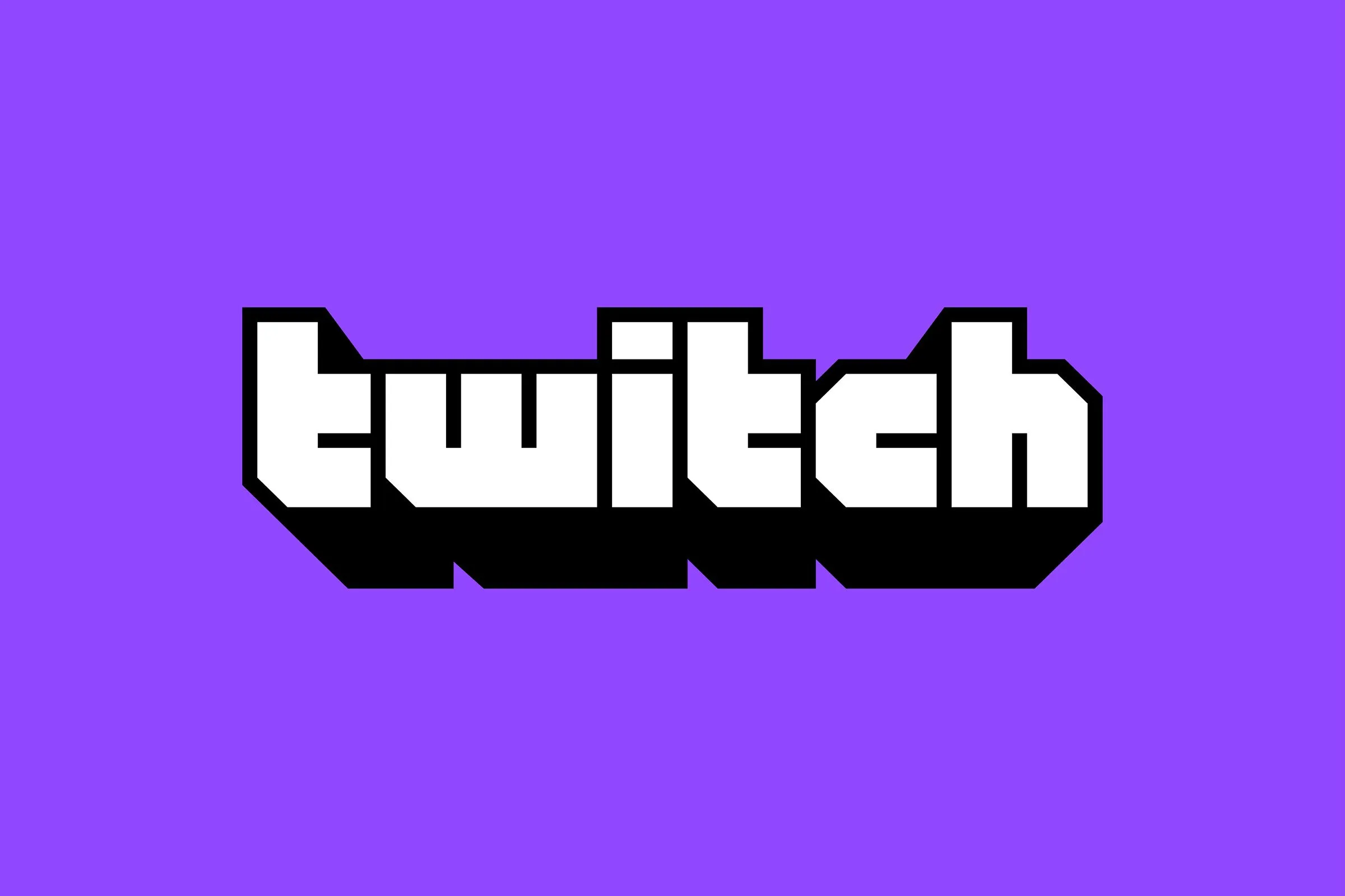
Twitch has a new look eight years after the company launched.
Streaming service Twitch launched a major rebranding today, revealing the news on its blog. The platform updated the color palette, logo, font, and website just in time for TwitchCon 2019.
The platform ditched the old logo and replaced it with a clean and retro alternative, reminiscent of 1980s arcade culture.
“Twitch is going bigger and friendlier (and less text heavy),” Twitch said. “The new logo features a bold, block letterform, with deep extrusion inspired by the retro game aesthetic.”

There’s no Twitch without purple, however. The company decided to keep the color, but refreshed it by making it brighter and more vibrant to match the “energy of the community.”

The streaming platform’s priority with broadcasting is to making content creators the focal point. The video player was updated to be edge-to-edge and the chat is more polished to make it less of a distraction from the main event.
Twitch users will be happy to hear that emotes remain unchanged from the rebranding, so you can keep spamming PogChamps and KreyGasms in the chat of your favorite streamer.
To accompany the update, Twitch has created it’s first brand campaign: “You’re already one of us.”
“The campaign which will launch in the weeks ahead is synonymous with Twitch’s vibrant and loud collage of internet aesthetics, emotes and memes that represents the community,” according to Twitch.
Fans can check out the platform’s updated branding at TwitchCon, which takes place this weekend in San Diego from Sept. 27 to 29.

