This week, with League of Legends’ Patch 8.14, we say goodbye to one of the last bastions of the golden age of League—the in-game cursor.
When Riot announced that the nine-year-old cursor was on its way out the door, we were struck with heartbreak. How could the cursor go away? Through all of those big, dramatic updates and changes to the client, champions, the map, runes, and pretty much everything else, the old cursor was the only thing that held on tight.
Well, after this week, if the legends are true, it’ll meet its outdated brethren in the Big Game Client in the Sky. Just like your pappy used to tell you. RIP old Urgot, the old client, masteries, and now the weird little hand-shaped cursor with giant fingers in some sort of gauntlet.
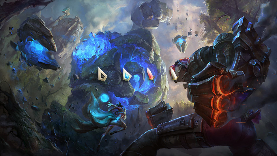
The new cursor has gone through several designs and iterations on the PBE over the past couple of months. Each new design has been a total overhaul of the cursor in every single way, including the basic cursor, hovering over an enemy, hovering over an ally, and how it looks in color blind mode. The version Riot seems to have settled on is the third version, which has been on the PBE for about three weeks now.
Let’s take a look at the brand new cursor, which may be sleek, updated, and all-around better, but gosh darn it, it’ll just never be the same, will it? May as well quit playing now (we’re joking, please don’t DM us on Twitter asking if you should actually quit playing).
Standard

Hovering an ally

Hovering an enemy

Hovering an enemy – colorblind

This new cursor arrives with Patch 8.14 tomorrow, alongside a new set of Worlds skins, Aatrox follow-up work, and a whole lot of balance changes.

