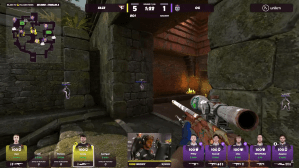
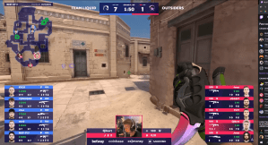
Since BLAST started organizing CS:GO tournaments in 2017, fans have praised its production quality, including the broadcast HUD and its colors. For some reason, however, BLAST threw its regular HUD in the bin ahead of the Paris Major RMR and came up with an entirely new UI that isn’t particularly pleasing to most viewers at home.
Since the RMR started today with the Asian teams, fans have voiced their disappointment with the HUD across Reddit, Twitch chat, and social media. The main problems, for the viewers, are that the new HUD covers too much of the screen and fans can’t see what grenades players are holding, how difficult it is to spot key information like K/D ratio, the kill feed font, and also the colors BLAST used.
“Awful HUD, ffs BLAST, don’t ruin the last CS:GO major,” one fan said on Reddit. “I don’t understand why BLAST, who without a doubt already had the best HUD out of any of the big TOs, has to change it to this dogshit-looking format,” another fan said.
There are dozens of negative comments like these and one fan even wants to start a petition to try to convince BLAST to revert to the old HUD—and there are already people on board with the idea. “Never should’ve changed this, I don’t understand this new HUD at all and the colors look weird as well,” one fan said. You can see the differences between BLAST’s new and old HUDs, respectively, below.


This is just the first day of the Paris Major RMRs and it doesn’t necessarily mean that BLAST will use the current HUD as it is during the Major in May—especially if the feedback is mostly negative like it is right now.
Dot Esports has reached out to BLAST for comment.

