It goes without saying that the world of Pokémon is iconic. Undoubtedly, the most important of these are the pocket monsters themselves. We all recognize that Charizard is cool, and even your grandparents knows who Pikachu is.
Thanks to Pokémon Scarlet and Violet, there are now over 1,000 critters, but not every ‘Pokémon ‘mon is created equal. For, you see, some of these poor creatures hold special places in our hearts for the truly unfathomable choices made in their design. We aren’t just talking underbaked either. The first, gut reaction anybody has to these creatures is a question.
Why?
Jynx – Gen 1
Were we going to start with anything else?
Taking the rose-tinted glasses off for one moment, the original batch of Pokémon was far more inconsistent than most millennials would care to believe. From the likes of Rattata, Pidgey, and Seel who are, well, just a rat, a bird, and a seal, to the unsettling Mr. Mime, I find it somewhat hypocritical that the divisive fifth-generation got as much hate from those my age as it did in its day.
In the lead for weirdest design in Gen 1 was Jynx. Whether intentional or not, the racist undertones present in the original Jynx were clearly going to land Game Freak in trouble at some point. The pitch-black skin color and the accentuated lips drew clear comparisons to Dragon Ball Z’s Mr. Popo.
Over the years, her look has strayed further away from this initial misstep but remains a real outlier with human-esque hair as luscious as Alolan Dugtrio. I still consider the bold move to double down on Jynx by creating Smoochum an all-timer in “why on Earth did they do that?” decisions.
Honorable Mentions: Lickitung, Tangela, Mr. Mime, Magmar
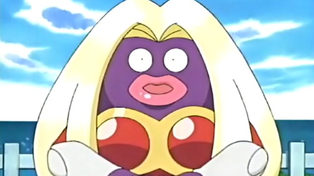
Miltank – Gen 2
It’s the udders. There’s no wild story, no controversy. The udders are just there, and I hate them.
It takes some doing to make this list over Wobbuffett and Girafarig, but here we are. Miltank could have just settled on being a cow Pokémon, right? Simply a normal cow. But no, it just had to be bipedal. It just had to wear a skin-tight black bonnet. Not to mention, Pokédex entries in Silver and FireRed imply that it defies the nature of this universe by birthing as real-world mammals do rather than eggs.
What the actual hell, Miltank?
Honorable Mentions: Wobbuffett, Girafarig
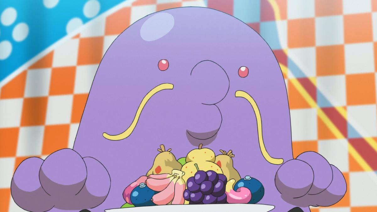
Swalot – Gen 3
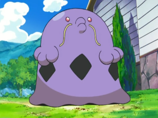
Pucker up.
Pokémon Ruby and Sapphire dropped some outstanding designs back in the early 2000’s; a large reason why it holds out as my personal favorite generation of the franchise.
Swalot (and its pre-evolution Gulpin) has not endured the test of time, and it doesn’t take a Mossdeep rocket scientist to figure out why. They both amount to nothing more than different colors of sludge with faces, bestowed upon which are lips straight out of a filler horror story. Swalot gets the nod on this occasion since he also had the gall to grow a spindly mustache.
It’s these elements, in combination with their meme-worthy names, that allow this line to be remembered at all. Perhaps that wasn’t for the best.
Honorable Mentions: Combusken, Nuzleaf, Gulpin
Lopunny – Gen 4
Beloved it might be, but Gen 4, we need to talk. From those largely awful evolutions for older Pokémon to the out-and-out ugly of Bibarel and Bronzong, I would be spoiled for choice had it not been for Lopunny.
Buneary is such an adorable design full of charm and cuteness. Its inevitable popularity ensured that it received a semi-starring role in the anime as one of Dawn’s roster for contests. Who then thought it would be a sensible idea to make its evolution thicc?
In a strange way, Mega Lopunny is what I think regular Lopunny should have been; a Normal/Fighting type bookending a neat character journey from harmless to prime kick-boxer. Even then, whoever contributed to the final design couldn’t help but add “ripped tights” to forever cement this evolutionary line in the history books as a warning.
Just because you can, does not mean that you should.
Honorable Mentions: Ambipom, Lickilicky, Rhyperior, Magmortar
Vanillish – Gen 5
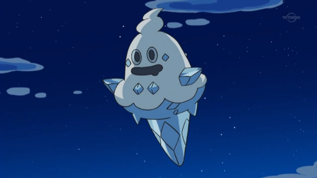
Generally speaking, I am absolutely fine with real-world, inanimate objects inspiring Pokémon. There are plenty of classic examples of how this has found success before. Just look at your Geodudes, Magnemites, and Sunfloras. Hell, Cofagrigus is based on a coffin and freakin’ rules.
Ice cream cones, though? Really?
I think what irks me is what could have been. Vanillite, all things considered, is actually pretty cute. Vanillish is anything but, with a face so gormless you’d genuinely question if anybody was home. The sprouting of an inexplicable second head is what gives Vanilluxe a point of intrigue in this contest of unjustifiable existence.
Truth be told, I wouldn’t miss any of them.
Honorable Mentions: Throh, Sawk, Klink
Quilladin – Gen 6
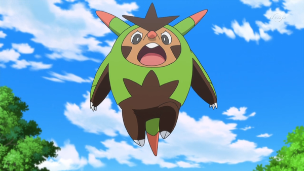
Featuring the least amount of Pokémon added to the roster of any generation to date, a lot of the hype surrounding X and Y was based on Mega Evolutions. Quilladin was not a part of this excitement, nor did it have any right to be, up there for one of the ugliest designs across any starter’s evolutionary line.
Looking like an unholy cross between Tingles from the Zelda games and Pinocchio, Quilladin is even more infamous thanks to its fellow offerings from Professor Sycamore. Both the Delphox and Greninja lines are still very popular; both are playable characters in Pokémon UNITE. As someone deeply embedded in that particular community, I can say with confidence that nobody asks for Chesnaught.
A rare big miss for Game Freak on one of their generation-defining trios.
Honorable Mentions: Barbaracle, Klefki
Crabominable – Generation VII
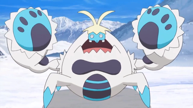
James, I hear you exclaim, you had me up until this point. I might have disagreed with you and the Dot Esports team on a couple of these but overall, I get it. How could you choose Crabominable over any of the Ultra Beasts? Well, good friend, allow me to explain.
The Ultra Beasts are specifically designed to be wacky. If I look at Xurkitree or Guzzlord, knowing their lore as anyone should having played any of the Sun and Moon series, we are prepared for the unexpected. They transcend our criteria because the intention to surprise is embedded in their DNA.
For Crabominable, we cannot say the same since its inspirations are clear from the name alone. This creature’s legitimacy is totally undone by the fact that—as far as my personal research has shown—the Abominable Snowman has not once been depicted as a crab. You’d think that “man” would suggest that much.
Honorable Mentions: Turtonator, Bruxish
Stonjourner – Gen 8
I find it impressive how Sword and Shield brought so many silly Pokémon into our lives that are inexplicably charming. Applin and its evolutions should not work as well as they do. The audacity to conjure up Mr. Rime even pays off.
Stonjourner just doesn’t land the same way. It’s one thing to be inspired by an animal or object. Just take a look at Duraladon for how to achieve this. It’s another to be inspired by a very specific landmark and Stonjourner feels like it’s cosplaying as Stonehenge. A very clumsy execution of what seemed like a doomed idea from the start.
Honorable Mentions: Drizzile, Perrserker
Pawmo – Gen 9
It seems quite poetic to leave the most disappointing of Pokémon designs until last. This creature does something that none of our others have. It makes us question if the people behind it put any thought into its creation. A case worthy of the baffling moniker that had us double-checking the internet to make sure that what we were seeing was correct.
I’m, of course, talking about the bewildering Pawmo—evolution to Pawmi, albeit you’d find yourself forgiven for thinking they are the same being. Scarlet and Violet certainly provided us with some underwhelming evolutions such as Dudunsparce and Maushold, yet Pawmo takes the cake somehow. Pawmi stands up, turns the saturation up a touch, and there you have it.
So little effort was made that it makes the next stage, Pawmot, look better despite hardly any changes for itself to claim. Thanks to Pawmo, the Pawmi line has comfortably claimed the crown for worst “Pika-clone.”


Published: Sep 22, 2023 10:46 am