A year after the launch of Modern Warfare 2, the game’s user interface is still under fire in the community, especially since the move to Call of Duty HQ has kept it largely the same.
CoD HQ is the new all-in-one application on all platforms where multiple games will launch from. Modern Warfare 3, MW2, and Warzone are all found within the HQ now. But not many players seem to be enjoying its user interface.
The UI, which is reminiscent of streaming apps like Netflix and Hulu, uses large horizontal blocks to select game modes along with a vertical sidebar to select each game.
And as many in the community point out, it’s confusing and there are YouTube videos explaining how to find certain things within the app. But that’s not stopping Activision from defending its design and considering CoD HQ an evolution in the franchise.
“MW2 served as the soft launch for Call of Duty HQ, where all future Call of Duty titles can be played from the same location,” Activision said in a blog post celebrating 20 years of the franchise. “This makes deploying to the battlefield even more straightforward, with players and squads worrying less about where to launch and focusing more on how to score their next victory.”
Many players could not disagree more with CoD HQ being “more straightforward.”
“The UI is shocking,” said YouTuber Westie in a reply to a post about the subject by CharlieIntel. “Endless horizontal and vertical scrolling. Just make the boxes smaller. Fit more on the screen.” He supplied a picture of Modern Warfare 2019’s UI, which was simpler and less cluttered.
Having a central hub for all CoD titles seems to be more of a hassle to some players than anything else, as many illustrated in their social media posts.
“Call of Duty HQ is terrible, and the UI for MW2 and MW3 is very annoying to navigate,” another player said. “Modern Warfare 2019, Black Ops Cold War and Vanguard all had better UIs.”
“How is launching one app to launch another app any easier or straightforward than just launching the game?” one player said. “You would think launching the game you want to play would be more straightforward right?”
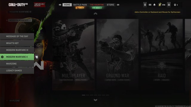
Currently, CoD HQ contains six different vertical tabs that can be accessed from the left side of the screen that select individual games like MW3, MW2, Warzone, and even MW 2019. Once selected, the slides go horizontal, and there’s even more, with seven possible tiles to select for MW2, as an example.
Then, there are tabs at the top of each screen for the battle pass, event, and store, so there’s quite a bit of navigation needed no matter what you’re trying to accomplish in CoD at any given time. But it doesn’t seem like this interface is going away, much to the chagrin of many in the community.
“Genuinely the worst UI I’ve ever used on any video game,” another player said.








Published: Oct 27, 2023 10:29 am