Diablo 4‘s closed beta has finally been released, and players from across the world are checking out the demon-slaying affair for the first time. While there have been a number of issues with logging in and staying connected to servers, it seems that the players’ biggest gripe with the game doesn’t have anything to do with that at all: some on social media have taken issue with the user interface and layout.
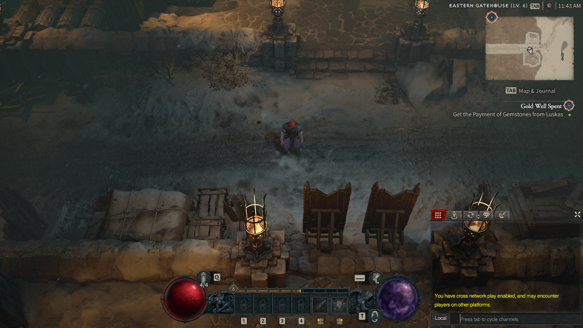
In a recent post on Reddit, one user took issue with the UI fonts, but this served as a jumping-off point for other fans of the game to express their issues with the wider interface as well. To start, many comments on how Arial doesn’t strike the same chord as the stylized font from traditional Diablo games. Some users in the comments pointed out that this may have been a choice to help more players be able to read it comfortably.
Another commenter goes into greater detail about their issues with the interface, and it includes a whole list of questions about why certain choices were made, concluding that the UI is a weak point of the game due to how the font feels off, the icons and text are too big, and the poor use of available space on the screen.
Some of the other issues include placing the chat box in the bottom right corner instead of the usual left and the lack of any option to change the size of the UI.
Many have commented that there’s little Blizzard can do to alleviate this ahead of launch, with less than three months until the 1.0 release.


Published: Mar 18, 2023 12:43 pm