For anyone who has tipped their toes into Once Human, clicking through dozens of menus to claim rewards has become part of the core experience. But partly due to its Asian mobile game-esque roots and partly to the hubbub following the six-week reset cycle announcement, the atrocious UI design mostly went under the radar—until yesterday.
In a Reddit thread that has since become the fifth most upvoted post in the Once Human subreddit in the past week, players came together to express their vexation at the poorly designed menus. “Too many goddamn claim menus. Once I unlock something, just give it to me, don’t make me go claim my unlock. Or at least just have one menu for all claims,” the original post read.
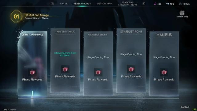
“It’s like this on purpose. It’s so that you go to the menus and calm and see other buttons that lead to the shop,” one player said, alluding to the alleged dark pattern in Once Human’s user experience. “It’s the same reason the currency is split up, having them in the same place would be easy. The point is for you to be confused.”
While games using cluttered menus as a smokescreen for driving microtransactions has become an industry trend, Once Human arguably cranks it up a notch. And if this is the scenario at the game’s launch, it’s a reasonable concern how it will be a few cycles later with more content in the mix.
“So many menus and different whackadoodle currencies already,” a player added. “Usually, a game isn’t this messy till it’s got a few years under the belt.”
Then, of course, there is the inevitable conversation about Once Human’s Asian roots. Coupled with the fact that it is also slated for a mobile release down the line. “This is a very Asian game design. It is just how they make games,” a player said, alluding to other Asian MMOs like Lost Ark that had global releases in the last few years.
This does not absolve Once Human of its shortcomings though. If Starry Studio and Netease aim to succeed with a Western player base on PC, they have to cater to the sensibilities of that audience. Streamlining the dozen menus you’d have to navigate to claim your rewards would be a good starting point in that direction.









Published: Jul 22, 2024 04:47 am