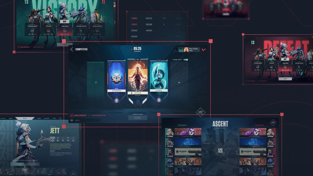
With the “future of VALORANT” in mind, the developers at Riot Games are planning to roll out a series of upcoming user experience and user interface changes starting with Patch 5.08, including a huge overhaul to the post-game screens showing victory and defeat.
The new victory and defeat screens featuring a “bold team shot” will help “show off your team’s MVP and your team composition while reinforcing the emotional narrative coming out of your most recent game—win or lose,” according to Tea Chang, UX design manager for VALORANT at Riot. The new images are certainly more striking than the basic victory or defeat screens currently displayed at the end of matches.
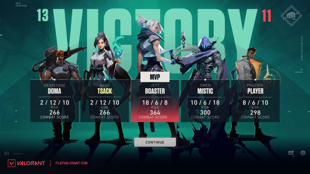
The mockups displayed perhaps indicate that new post-match screens are something the team has been considering for a while, considering that they use an older version of the Fnatic lineup from 2021. In the graphic, the team also mysteriously replaces former Fnatic member Muhammad “Moe40” Hariff’s name with just “player.”
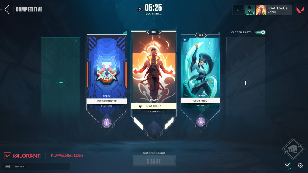
Regardless, the UX and UI teams for VALORANT are also planning to tidy up both the lobby screen and the pre-match faceoff screen. A lot of pre-match clutter is set to be removed to improve readability on the lobby screen and draw more attention to player cards. The same can be said for the pre-match faceoff screen: less clutter and more space for players to display banners, titles, and rank.
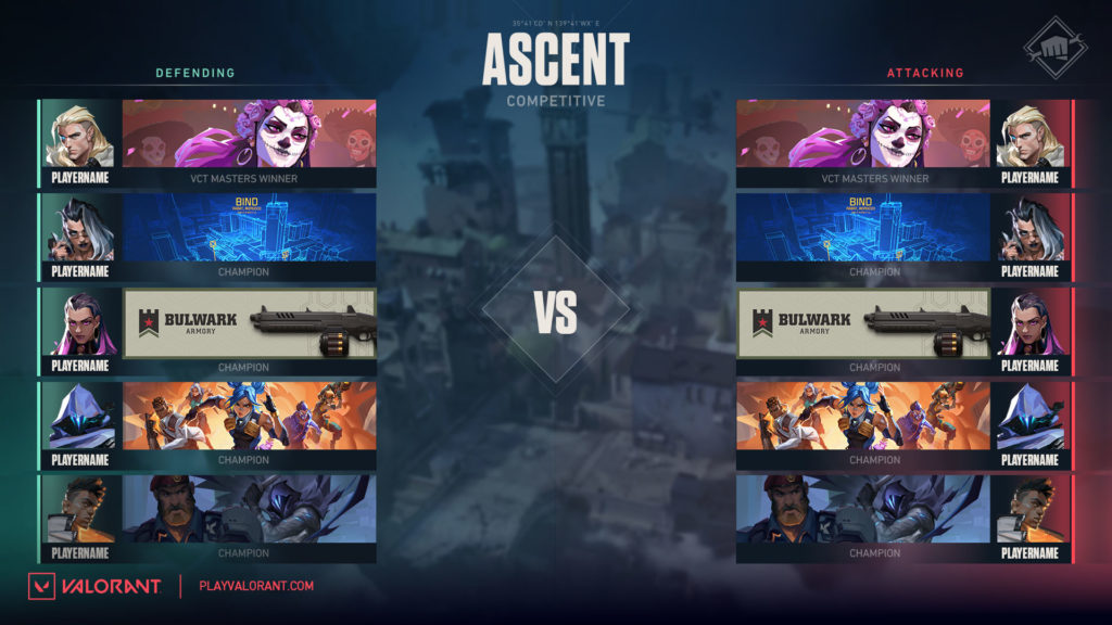
The team alludes to these changes as just the beginning of a wave of “visual polish” set to hit the game via more user experience and visual updates. “Multiple” teams are supposedly working on improving the game within this area.







Published: Oct 12, 2022 04:30 pm